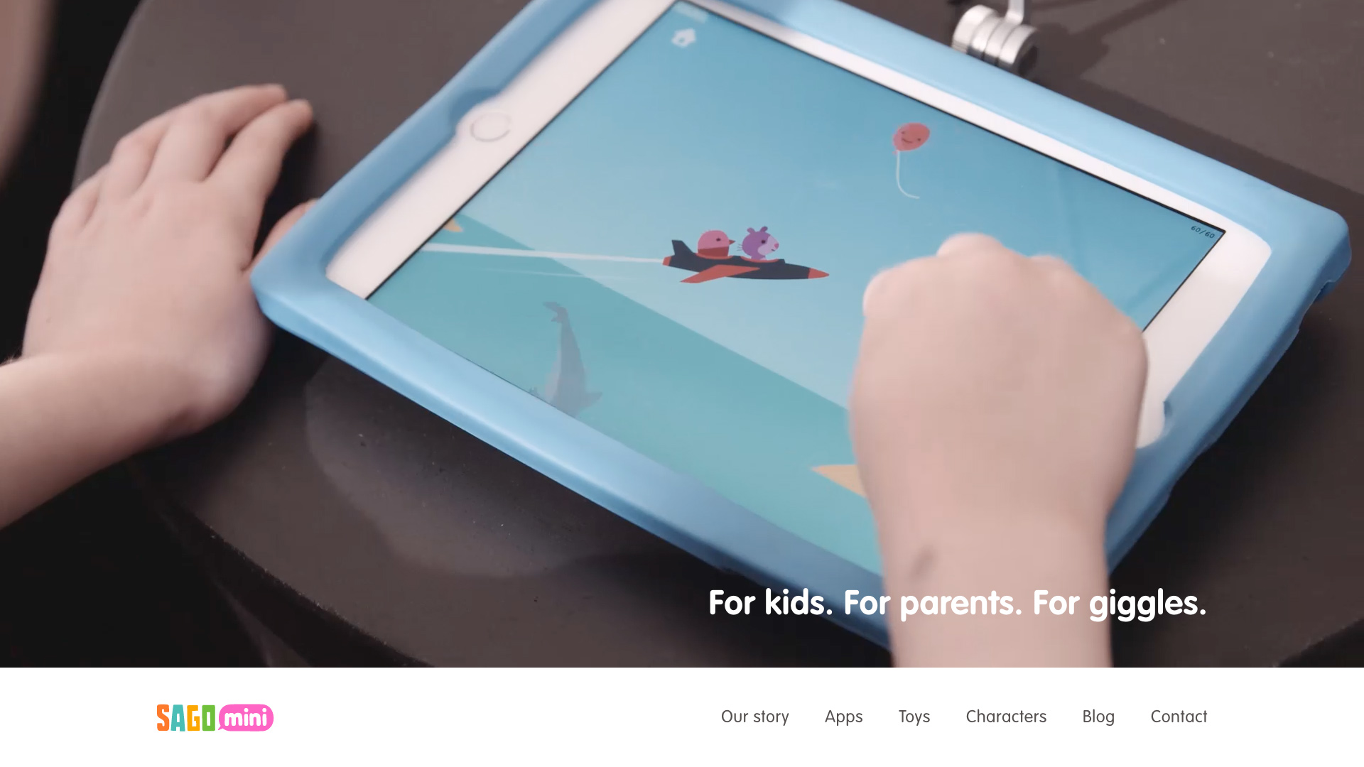
For kids. For parents. For giggles.
——Sago Mini
The world’s happiest website!
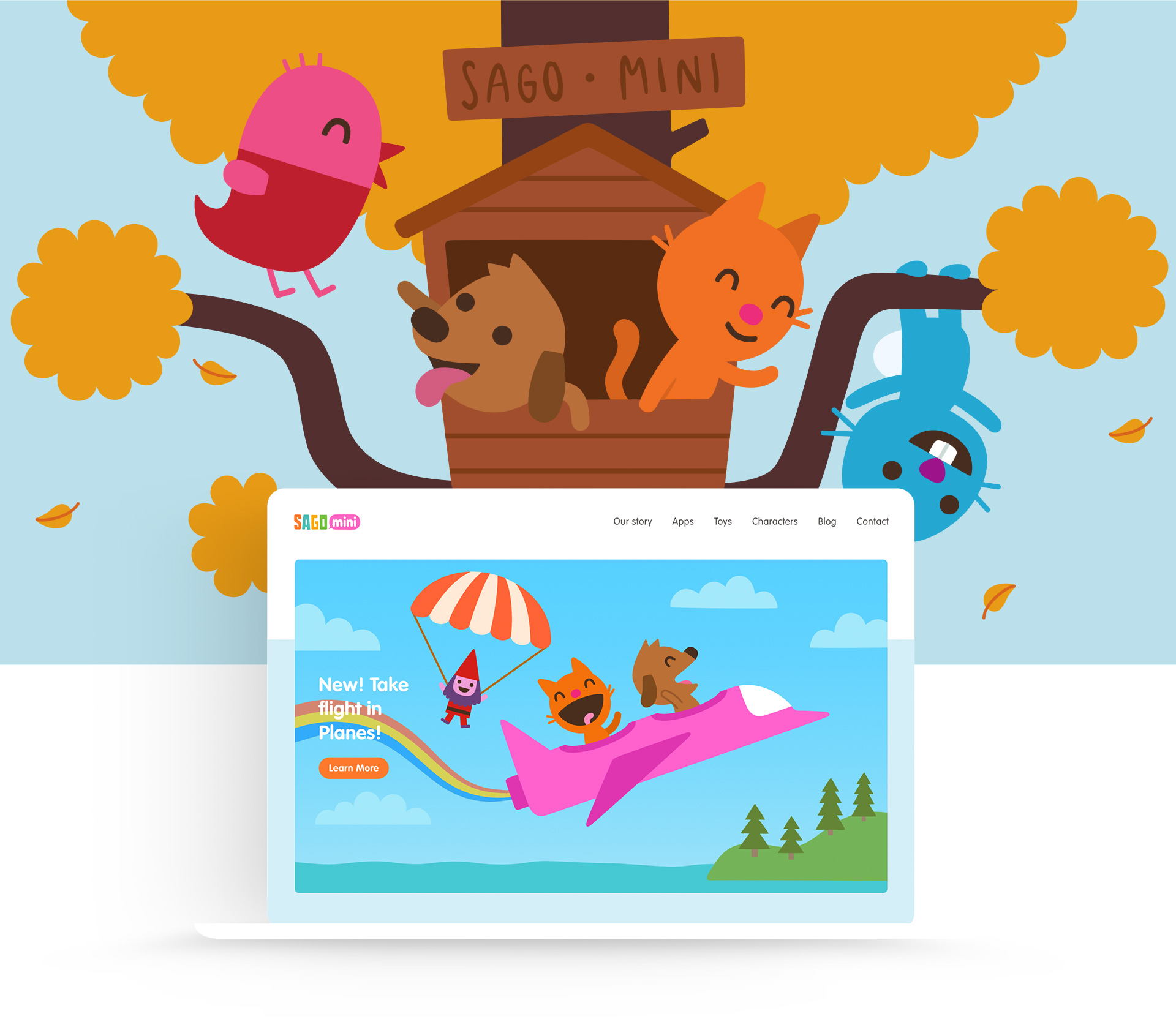
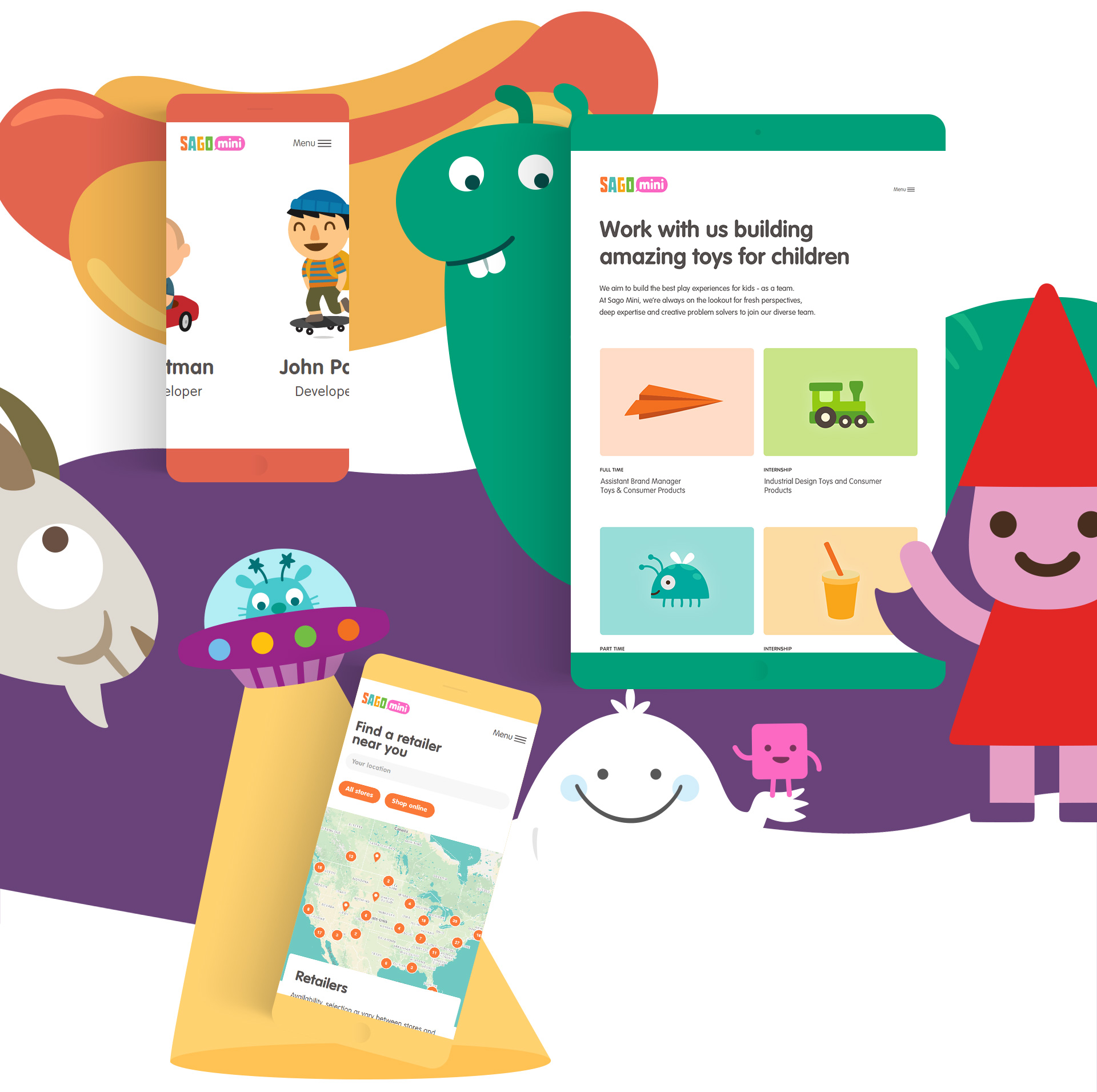
Expanded product offering
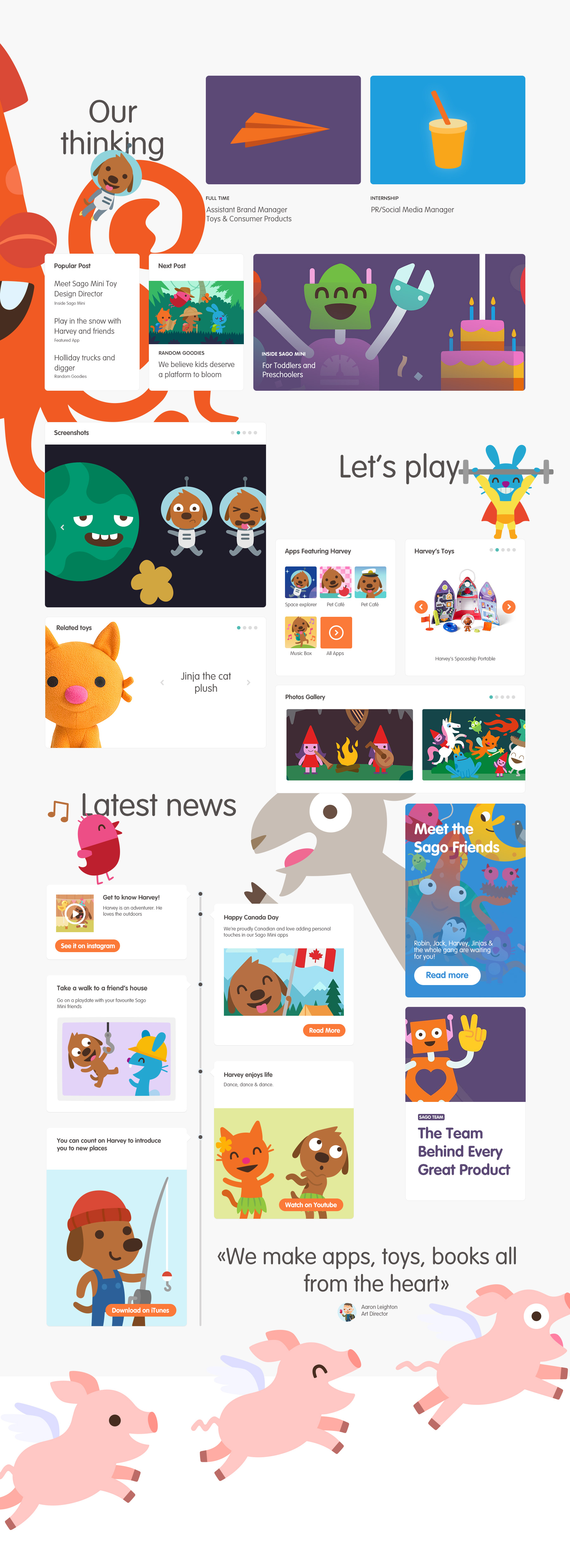
As one of the most admired and trusted preschool brands in the world, Sago Mini wanted a new website to communicate their brand values and expanded product offering through an interface as charming and playful as their identity.
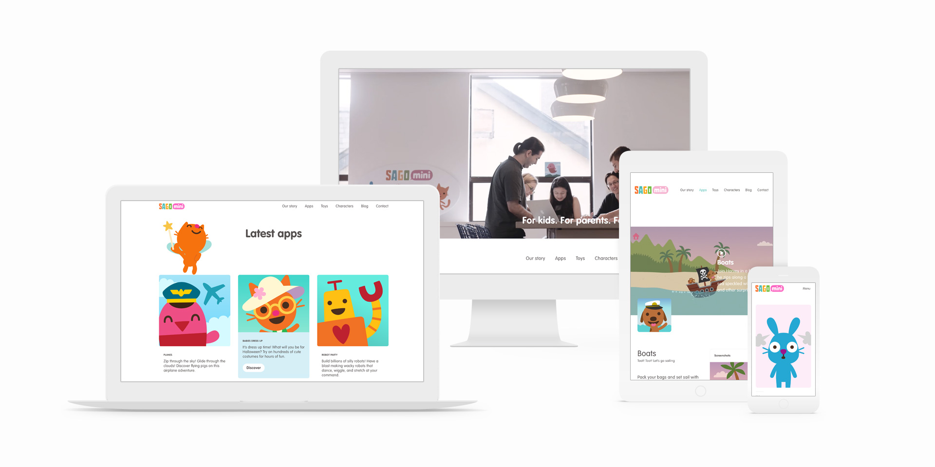
A strategic user flow
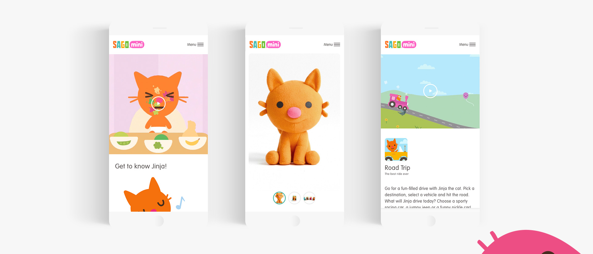
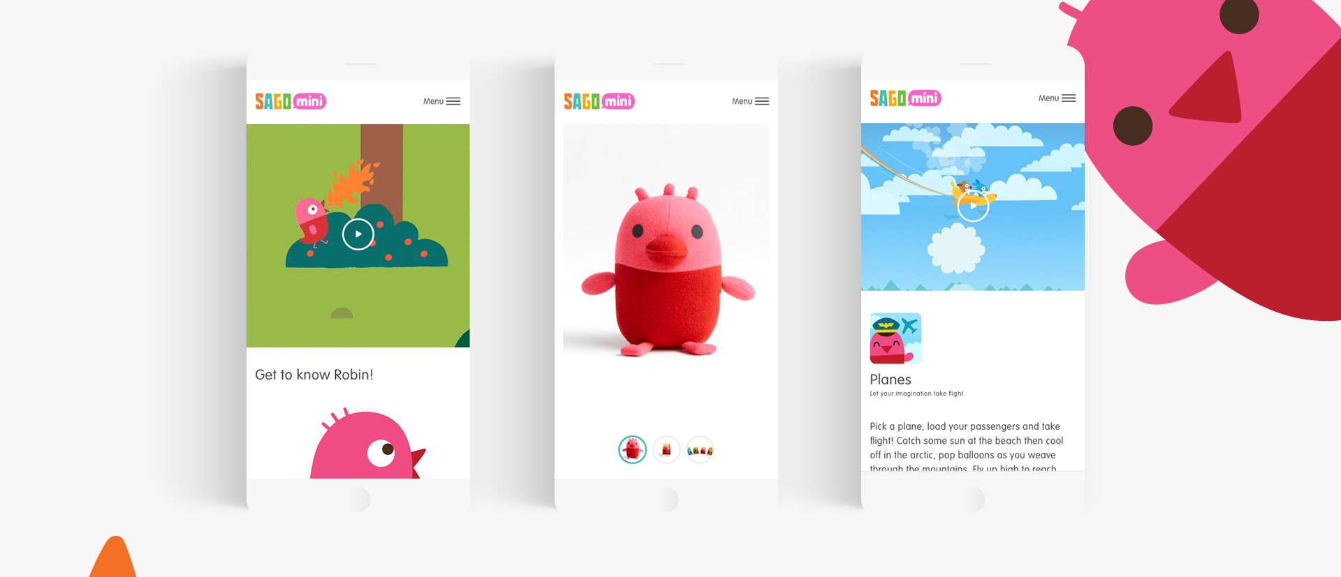
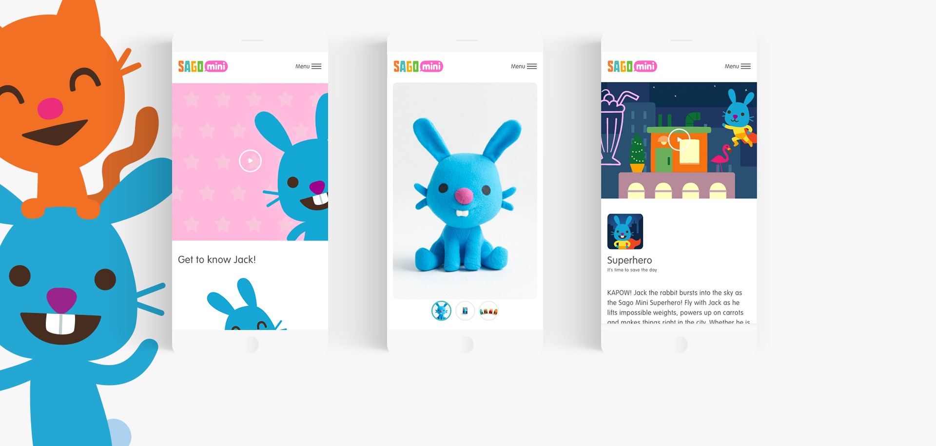
Sago Mini's product range is characterized by a group of friendly characters. This inspired us to create a site architecture designed with a specific user flow, to promote discovery of the brand's mobile apps and toys through each of the characters.
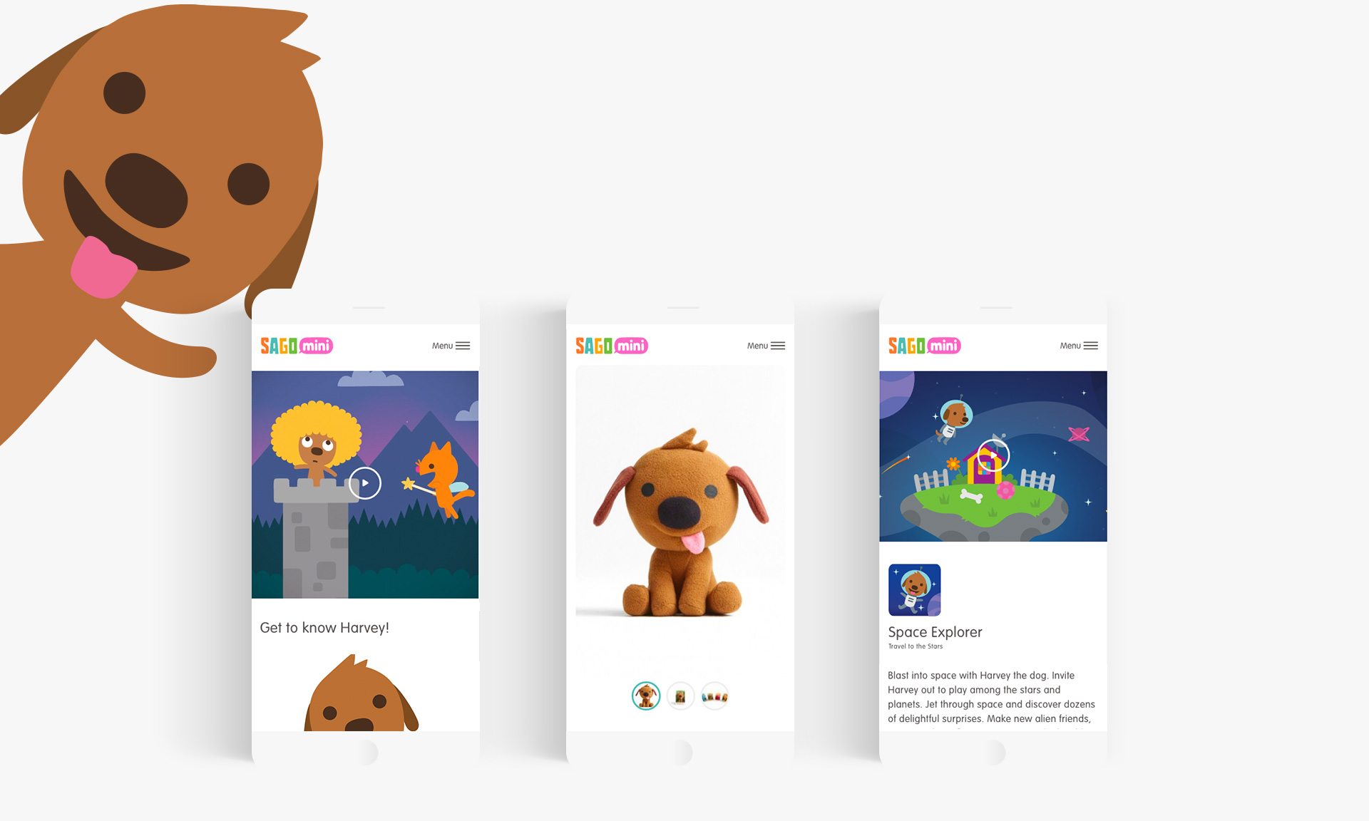
Inspired by our inner child
The brand’s iconic quirky artwork is brought to life with animations of beloved characters along for the ride. The result. An engaging journey, smiles guaranteed.

